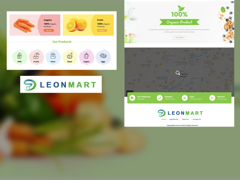
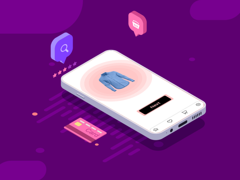
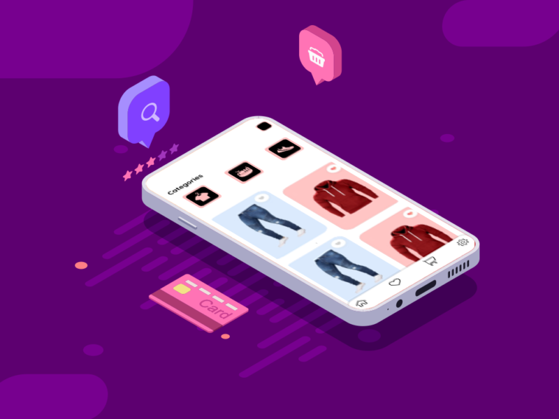
The strategy for Leonmart, the organic grocery online website, is centered around showcasing a diverse range of organic vegetables and fruits. The chosen color combination of green and blue, in accordance with client preferences, aims to evoke a sense of freshness, trustworthiness, and harmony. The primary goal is to provide an online platform that not only offers high-quality organic produce but also fosters a positive and reliable shopping experience for customers.
Design
The design process for Leonmart followed a systematic approach to align with the established strategy and client requirements:
Client Consultation: Initiated the design process with a comprehensive consultation with the client to understand their vision, goals, and specific requirements for the organic grocery website.
Market and User Research: Conducted thorough research on organic grocery market trends and user preferences. Gained insights into user behaviors, expectations, and the elements that contribute to a positive online shopping experience.
Color Palette Selection: Aligned the color palette with the client’s preference, incorporating shades of green and blue to convey a sense of organic freshness and reliability.
Section Planning: Developed a well-organized structure for the website, categorizing products into sections such as vegetables and fruits. Ensured an intuitive layout for easy navigation.
Visual Elements: Integrated high-quality visuals of organic produce, leveraging images that showcase freshness and quality. Utilized green and blue accents consistently throughout the website for visual cohesion.
User-Focused Navigation: Designed a user-centric navigation system, ensuring that visitors can easily find and explore various organic products. Implemented clear calls-to-action for streamlined user journeys.0
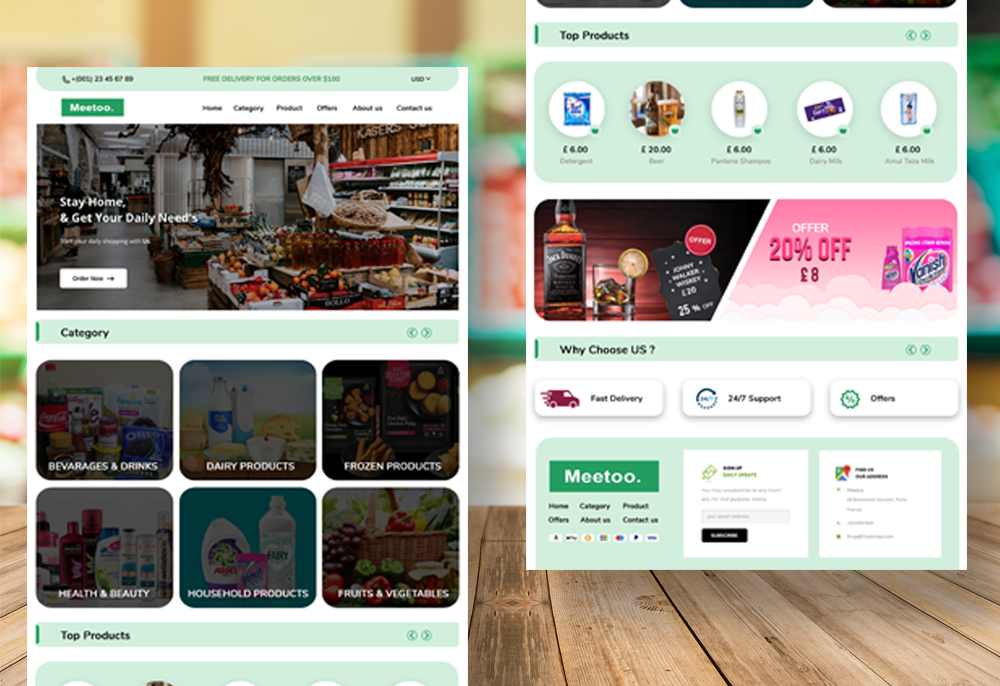
The strategy for the creative grocery website design centered around delivering a user-centric experience, combining ease of use with a touch of creativity. The primary goal was to create a visually appealing and intuitive platform that enhances user experience, encouraging increased engagement and utilization of the website. The chosen color scheme of dark green and light green was selected to evoke a sense of freshness and align with the nature of grocery products.
Design
The design process followed a meticulous approach to ensure simplicity, clarity, and creativity in line with the overall strategy:
User Research: Conducted thorough user research to understand the preferences, expectations, and habits of the target audience when it comes to online grocery shopping.
Define Design Goals: Clearly defined design goals centered around creating an easy, clear, and simple website design that fosters user engagement and provides an enjoyable shopping experience.
Color Palette Selection: Chose a color palette of dark green and light green to convey a sense of freshness and naturalness, creating a visually appealing atmosphere for users browsing grocery products.
Section Planning: Developed a comprehensive plan for different sections of the website, including categories like fresh produce, pantry staples, and household items. Ensured each section was logically organized for easy navigation.
Typography Choices: Selected clear and legible fonts to maintain readability and enhance the overall visual appeal of the website.
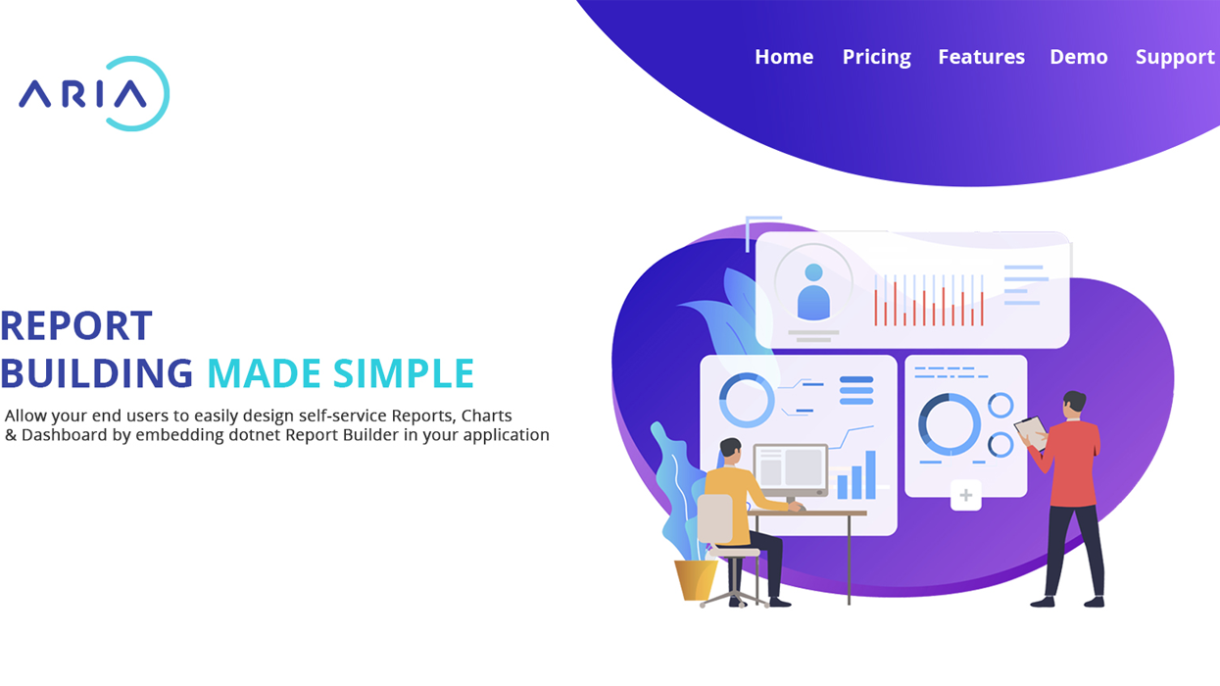
The strategy for the creative website design focused on showcasing the offerings of cloud services clearly and engagingly. The primary goal was to create a user-friendly platform that effectively communicates information about the products and services. Emphasis was placed on developing a strategy that ensures easy navigation through specific sections, namely “Our Products,” “Our Services,” and a comprehensive overview of what the platform provides.
Design
The design process involved a systematic approach to create an aesthetically pleasing and functional website for cloud services. Here’s an overview:
Research and Analysis: Conducted research to understand the target audience, their preferences, and industry trends. Analyzed competitors’ websites to identify opportunities for differentiation. Also, asked for an opinion in the form of an interview about the target audience and competitors.
Defining Objectives: Clearly defined the objectives of the website, and clarified with clients outlining the key messages and information that needed to be conveyed. Aligned these objectives with the goals of promoting products and services effectively.
Color and Style Selection: Established a color scheme that resonates with the brand identity, utilizing shades that evoke trust and professionalism. The style choices aimed at creating a modern and visually appealing design.
User Interface (UI) and User Experience (UX) Design: Focused on creating an intuitive user interface with clear navigation paths. Prioritized user experience by making information easily accessible and ensuring a positive interaction with the website.
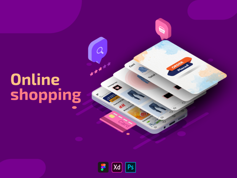
Through a wide variety of mobile applications, we’ve developed a unique visual system and strategy that can be applied across the spectrum of available applications.
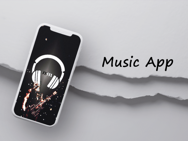
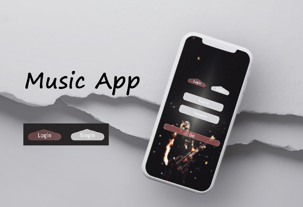
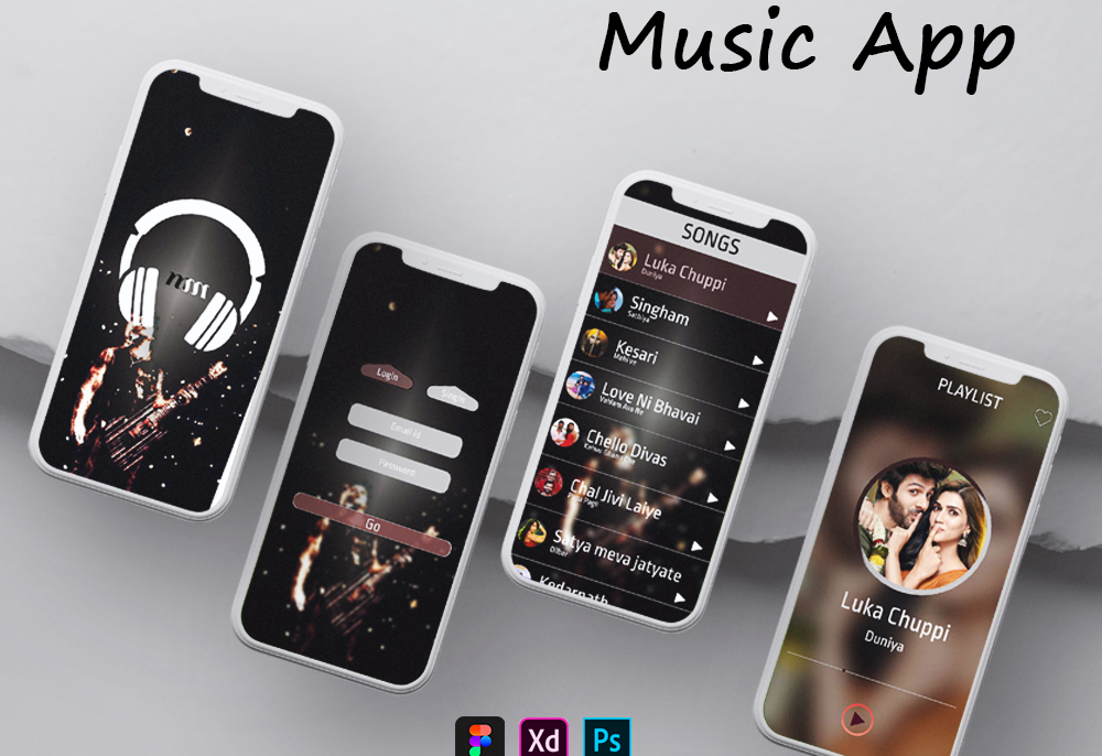
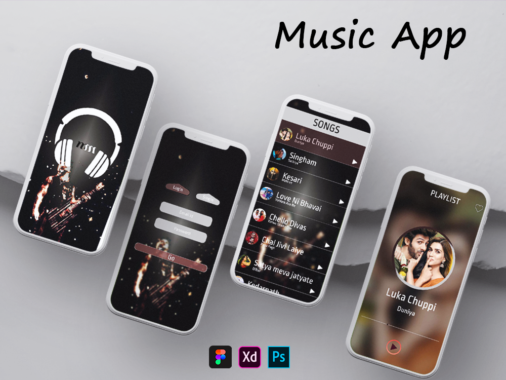
This music application, crafted as the inaugural project utilizing Figma, Photoshop, and Adobe XD, is tailored for an immersive music-listening experience. With a user-friendly design, the app comprises four distinct screens, ensuring simplicity and ease of use.
Design Overview:
Screen One: Splash Screen The app commences with a visually engaging splash screen that artistically showcases an image associated with music. This serves as an enticing introduction, setting the tone for the user’s music exploration.
Screen Two: Login Page The second screen presents a straightforward login page, requiring users to log in to access the musical content. This essential step ensures a personalized and secure experience for users.
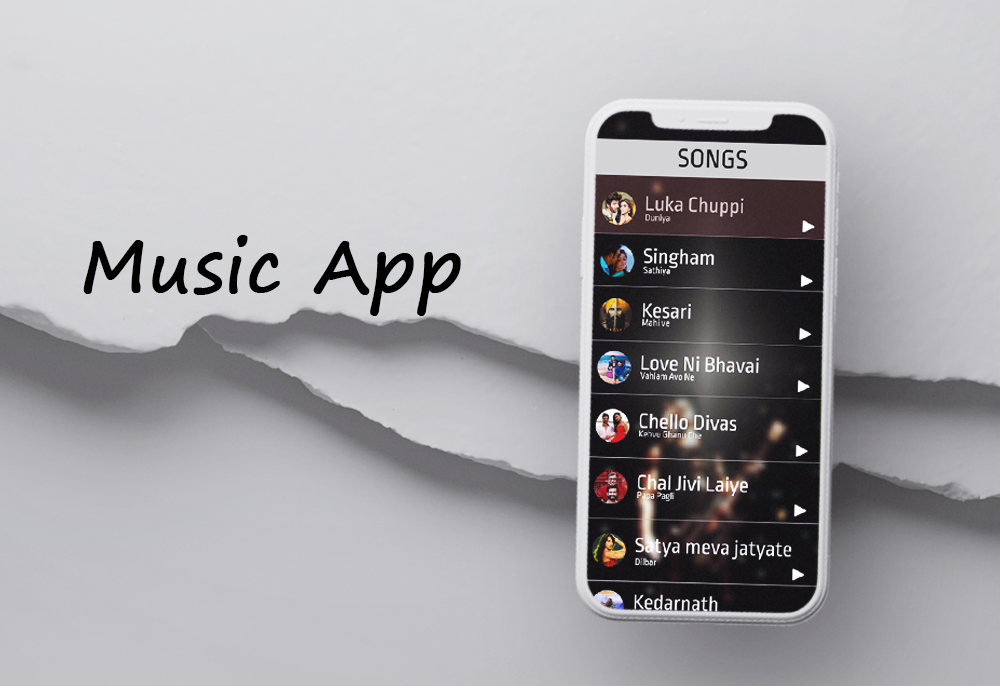
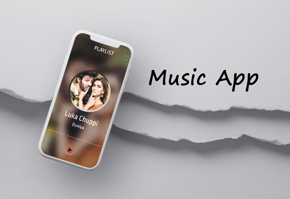
Screen Three: Playlist Home Page Upon successful login, the third screen unfolds, revealing the home page adorned with a list of playlists. The comprehensive display includes all offline songs, providing users with easy navigation and quick access to their favorite music.
Screen Four: Music Playback The fourth screen is dedicated to the immersive music playback experience. It features a play button for easy control, accompanied by a wishlist button, allowing users to mark songs as favorites. This integration enhances user engagement by enabling them to curate a personalized collection of beloved tracks.
The application’s minimalistic design approach and the sequential flow of screens contribute to its user-friendly nature. With the incorporation of captivating visuals and intuitive features, this music app provides a seamless and enjoyable musical journey for users.
Image Title Here
Design
UI/UX Design, Art Direction, A design is a plan or specification for art viverra maecenas accumsan.