


Meetoo. – Grocery Website Design
Strategy
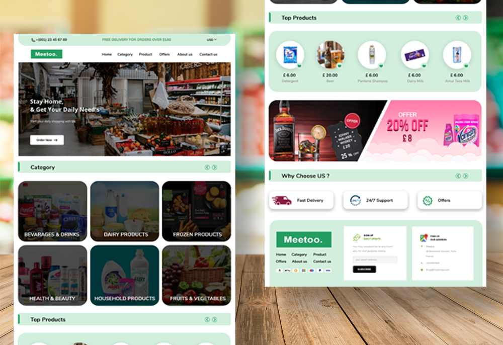
The strategy for the creative grocery website design centered around delivering a user-centric experience, combining ease of use with a touch of creativity. The primary goal was to create a visually appealing and intuitive platform that enhances user experience, encouraging increased engagement and utilization of the website. The chosen color scheme of dark green and light green was selected to evoke a sense of freshness and align with the nature of grocery products.
Design
The design process followed a meticulous approach to ensure simplicity, clarity, and creativity in line with the overall strategy:
User Research: Conducted thorough user research to understand the preferences, expectations, and habits of the target audience when it comes to online grocery shopping.
Define Design Goals: Clearly defined design goals centered around creating an easy, clear, and simple website design that fosters user engagement and provides an enjoyable shopping experience.
Color Palette Selection: Chose a color palette of dark green and light green to convey a sense of freshness and naturalness, creating a visually appealing atmosphere for users browsing grocery products.
Section Planning: Developed a comprehensive plan for different sections of the website, including categories like fresh produce, pantry staples, and household items. Ensured each section was logically organized for easy navigation.
Typography Choices: Selected clear and legible fonts to maintain readability and enhance the overall visual appeal of the website.